AzerGold
10th Anniversary Brand Identity
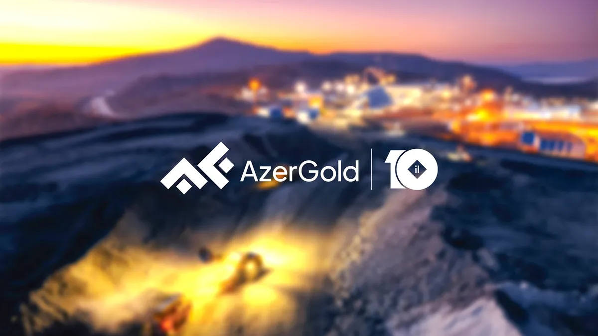
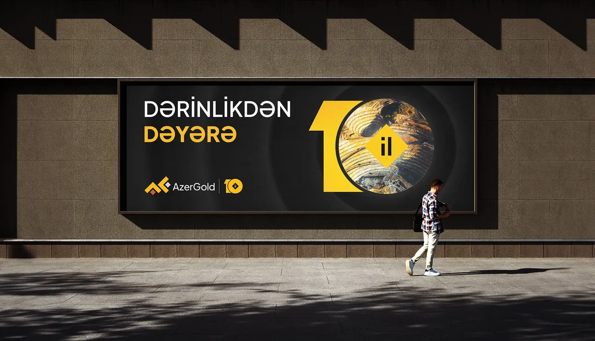
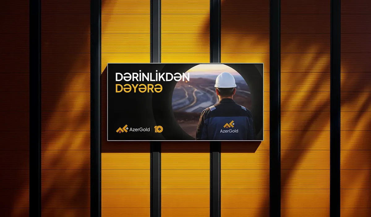
From depth to value
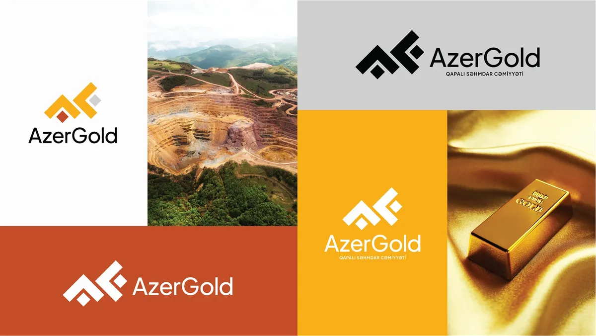
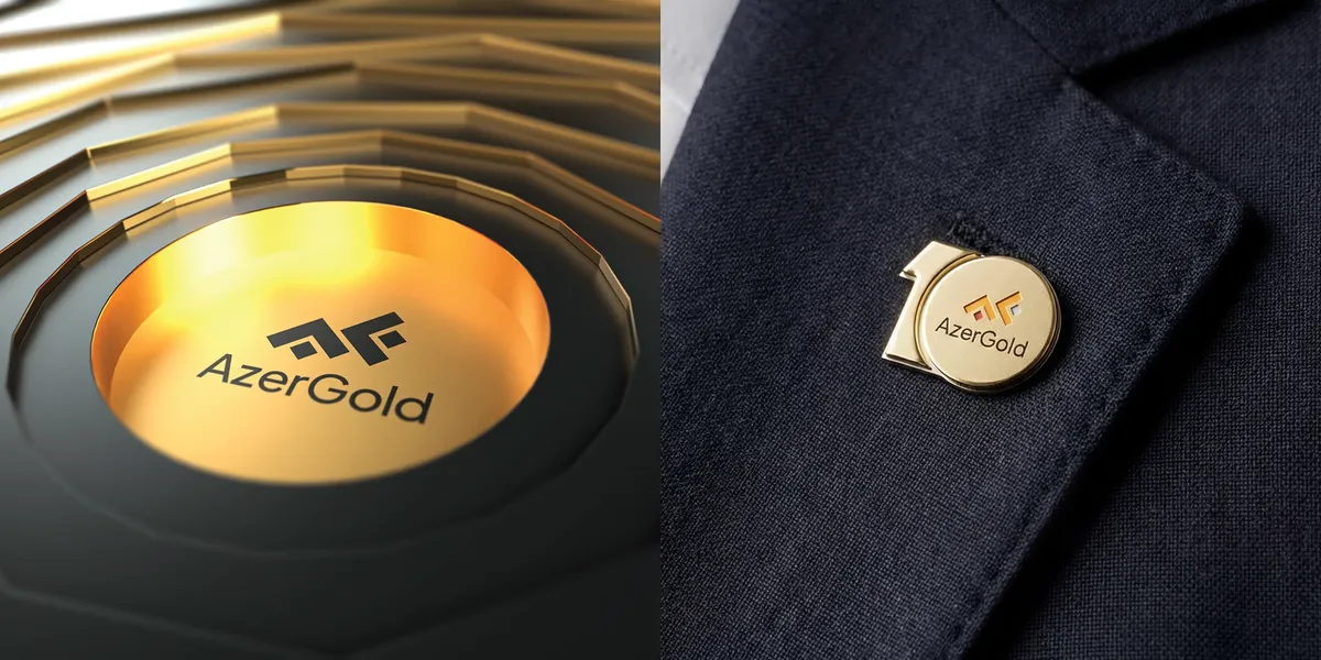
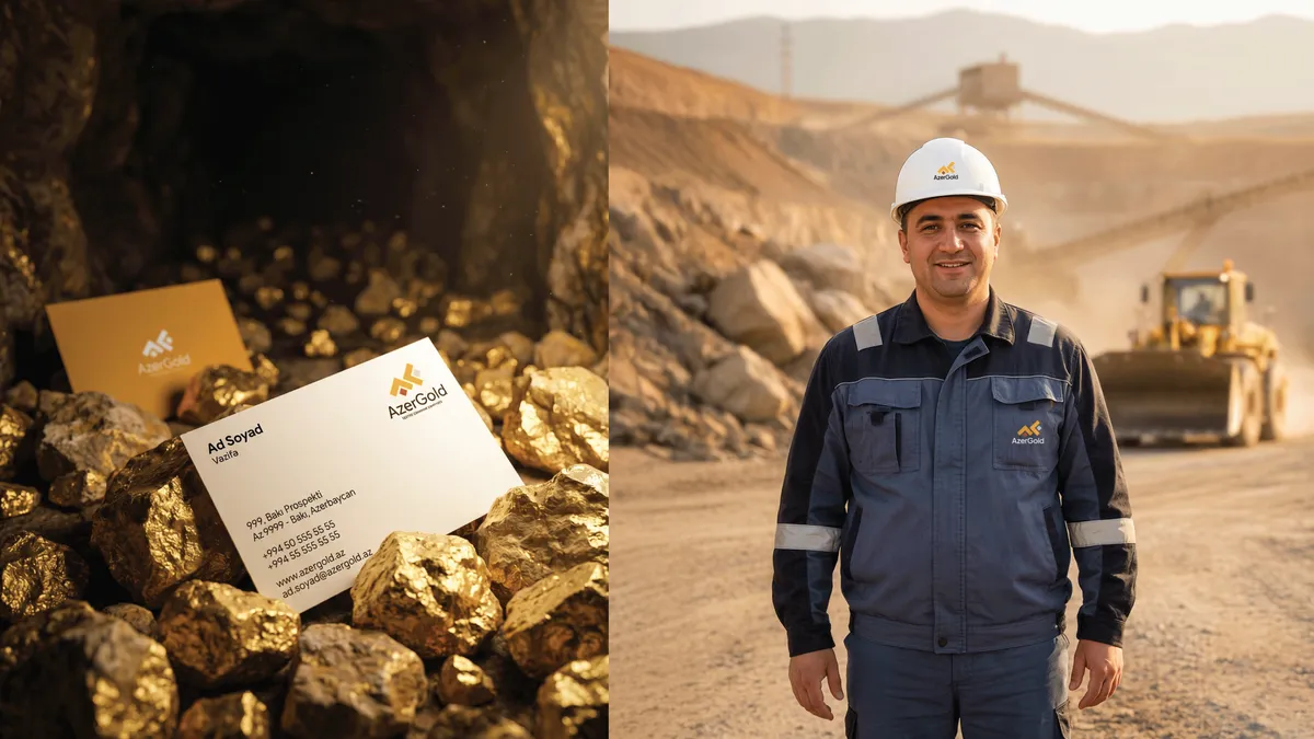
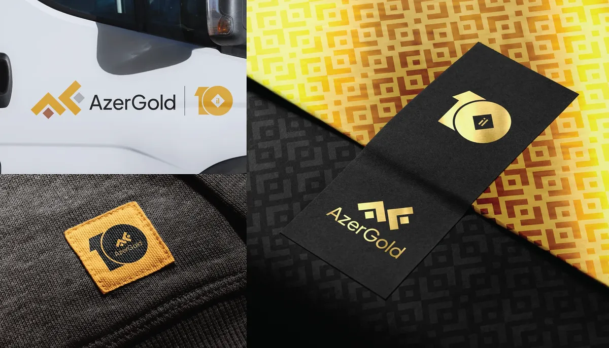
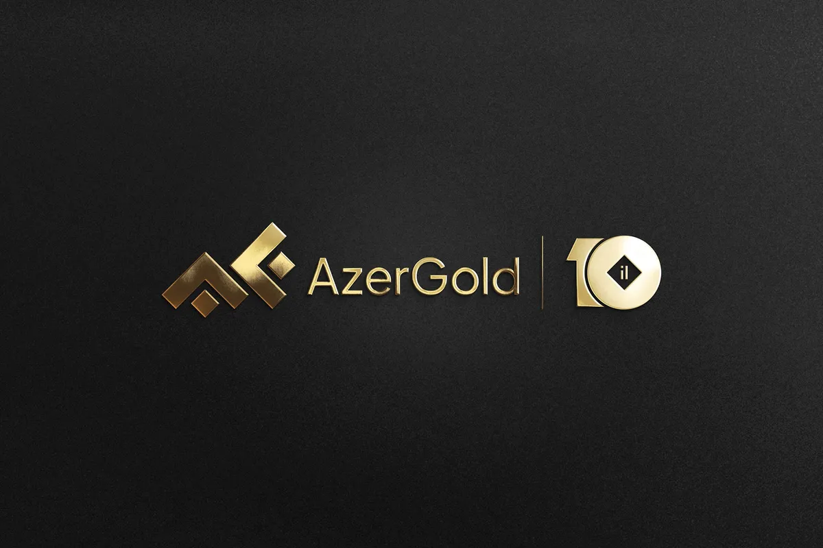
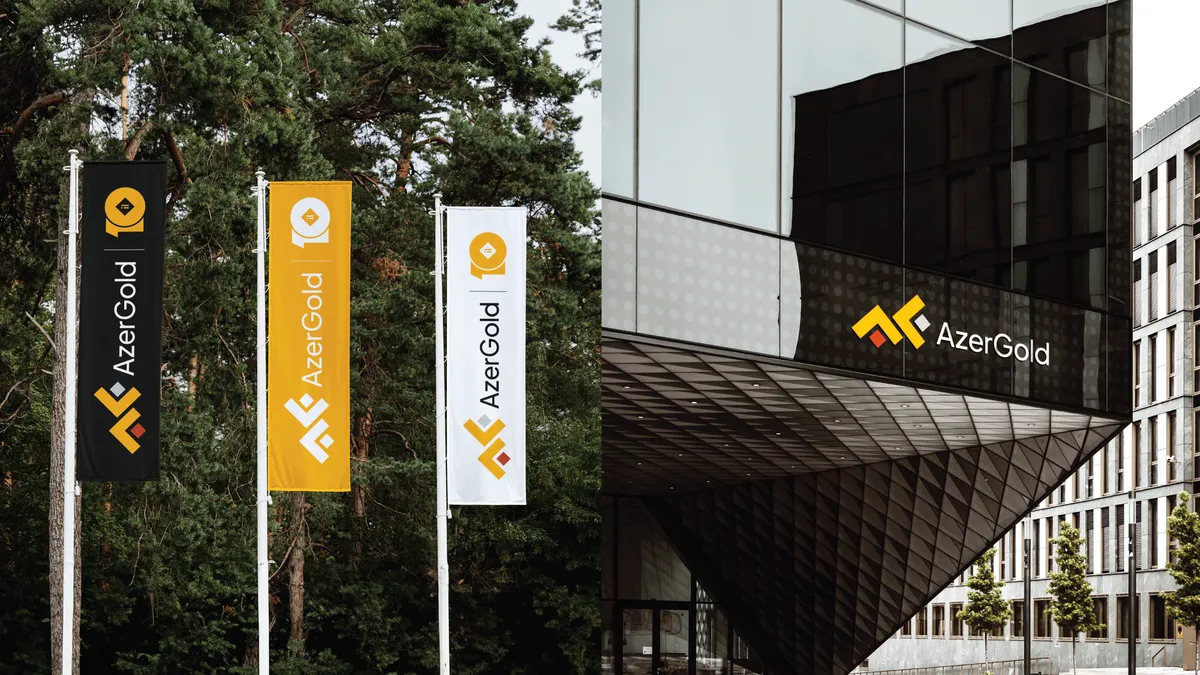
For AzerGold’s tenth anniversary, Element created a commemorative identity that marks the milestone without replacing the brand people already trust. The work covers the anniversary mark, a refined logotype, a visual system built around the number 10, motion and 3D films, posters, digital applications, corporate gifts and packaging.
AzerGold plays a strategic role in Azerbaijan’s mining sector, turning underground resources into value. In ten years the company built strong trust and reputation, but that progress had no clear visual expression. The task was to make the milestone readable and meaningful while keeping the strength of the existing brand.
The idea
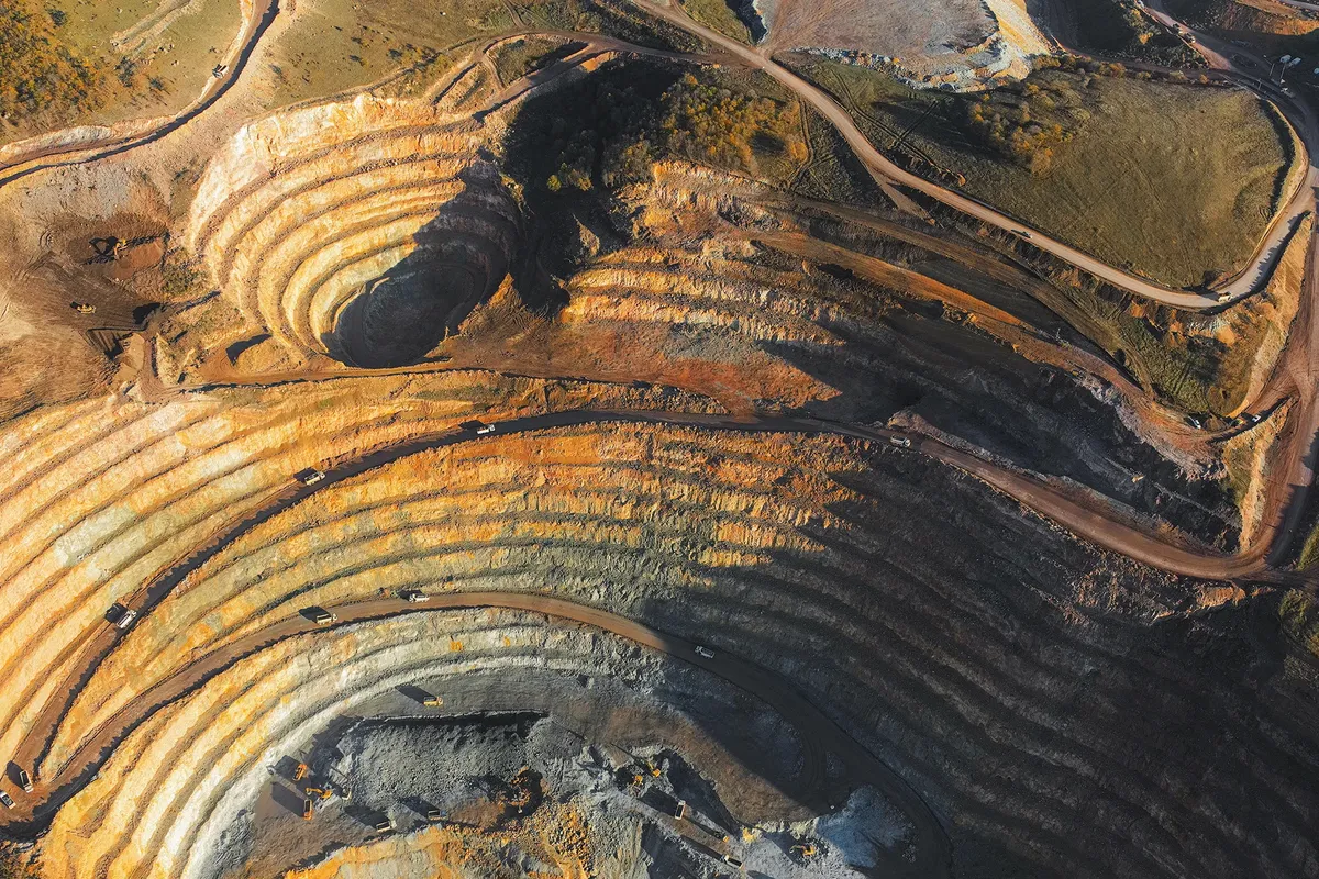
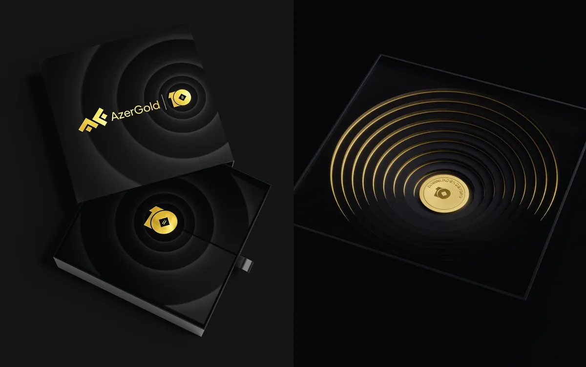
Mining is not just extraction — it is a gradual process of turning depth into value. The layered structure of the mark represents geological strata, and its ten layers stand for AzerGold’s ten years. The logotype was refined at the same time with more modern, balanced typography, giving the brand a steadier and more contemporary presence.
In the anniversary mark, the “0” is drawn as a mine cavity and the “1” as a line of direction and progress. The layers are arranged in a clear, balanced system that expresses both depth and growth.
One system, many applications
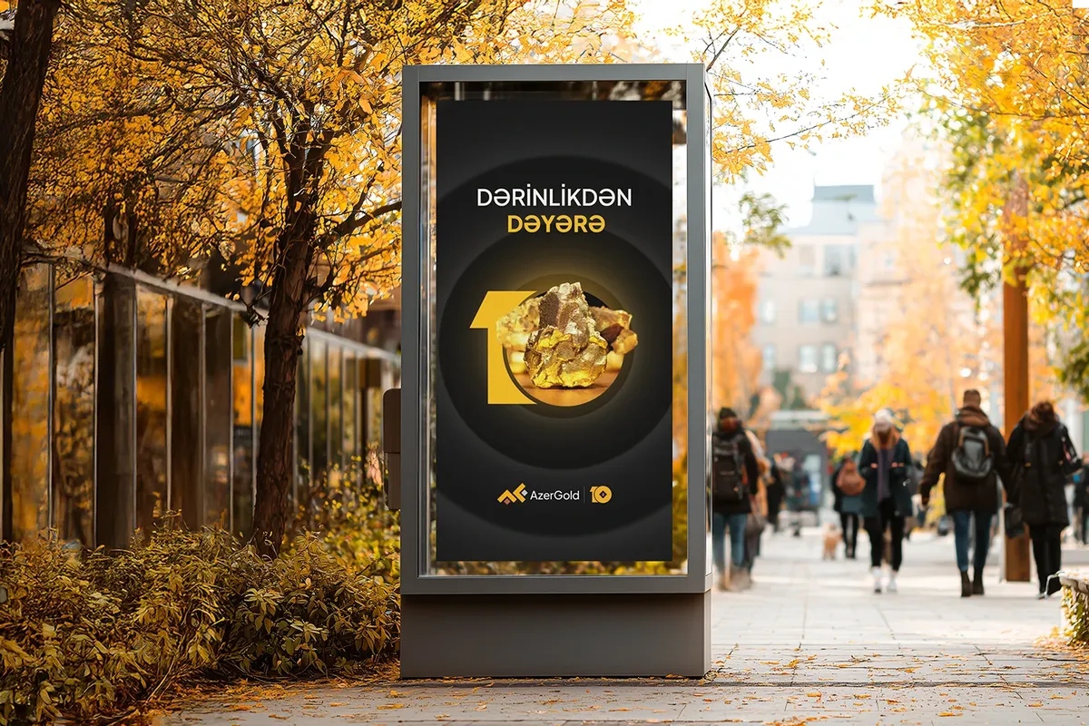
A flexible visual system was built around the “10”, so the anniversary could run from posters to digital platforms without losing consistency. The same “From Depth to Value” idea carried into corporate gifts and packaging, and into motion and 3D films that bring the layered structure to screens.

Made at Element