Packaging design is usually discussed as a visual problem and solved as a distance problem. A shopper decides at roughly two metres, in under a second, while moving. Everything that survives that moment is the brand; everything else is detail you are paying to print.
SIRAB has been on Azerbaijani shelves for 75 years. That is a large amount of recognition sitting in a small number of elements — the name, the colour, the droplet. The brief was to modernise without spending any of it.
What we kept, and what we let go
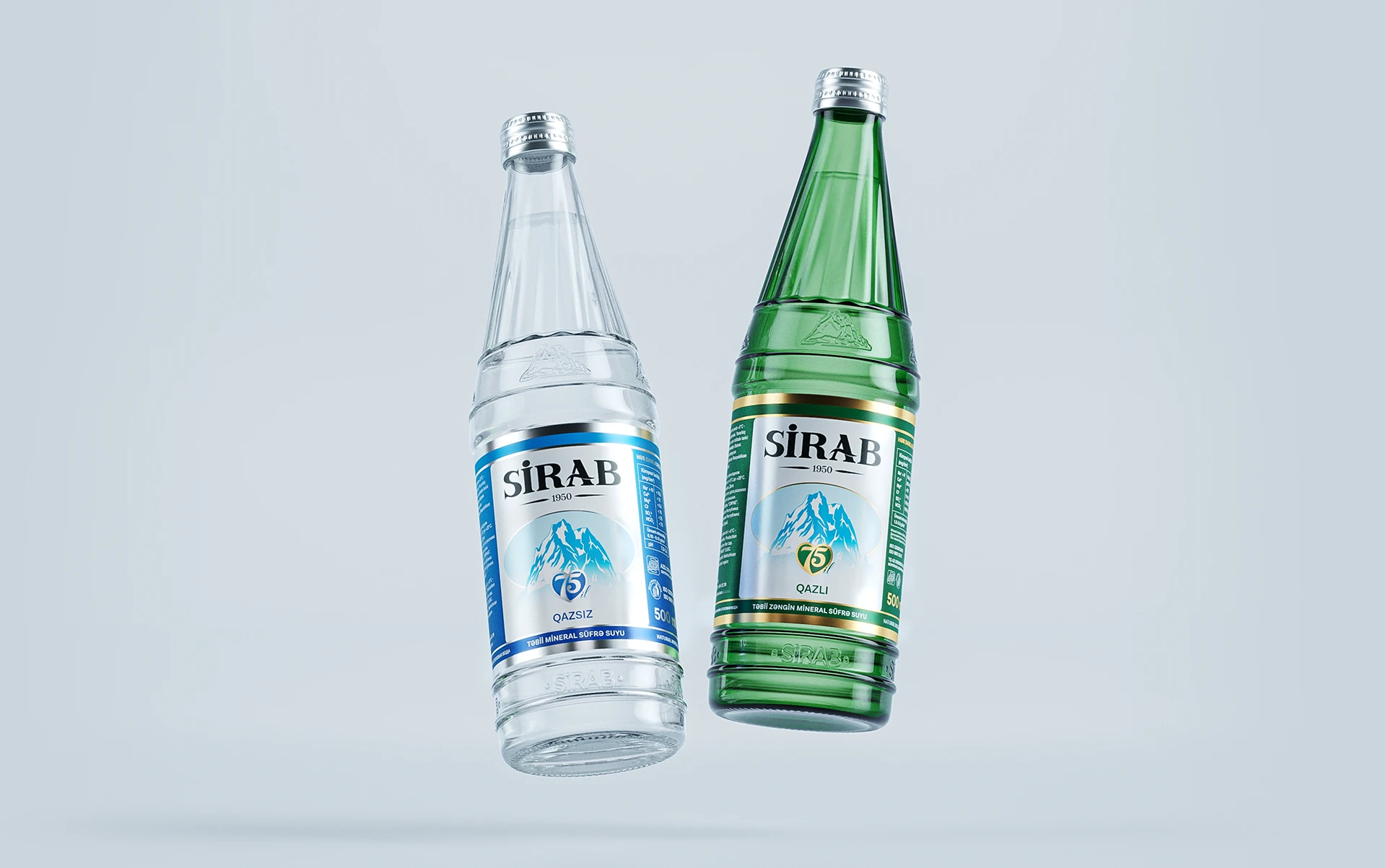
The identity was renewed in a more modern, minimal direction while staying with its core values. The logo was redrawn towards minimalism — not a new shape, a cleaner one: tighter curves, better optical spacing, a form that holds together embossed, printed on a wet bottle, or reduced to a favicon.
On the label itself the changes were deliberately small. Classic elements stayed. What changed was hierarchy: fewer competing type sizes, more room around the mark, a clearer separation between the brand block and the mandatory information. A label gets calmer not by removing content but by ranking it.
Rendering before printing
Every structure was built and rendered in 3D before anything went to print. This is not a presentation trick. A dieline that looks correct flat can fail on a curved bottle, and a colour that passes on screen can shift once it sits on a translucent substrate behind water.
Rendering the bottle in context — on a shelf, under retail lighting, beside competitors — answers the only question that matters: does it still read? It is far cheaper to find a hierarchy problem in a render than on a pallet.
The 75th anniversary mark
For the anniversary we added a separate commemorative mark rather than touching the master logo. It combines two symbols the brand already owns — a heart and a water droplet — with the numerals 7 and 5 forming the heart shape itself.
It works because it is additive. The anniversary mark can run on a limited edition, in campaign motion and at point of sale, then retire, while the identity underneath is untouched.