Most identities are judged on a screen. A hospitality identity is met almost entirely on objects: a key card, a door number, a folded towel, a coffee cup, a sign read from a car at night. The decisions that matter are therefore material decisions.
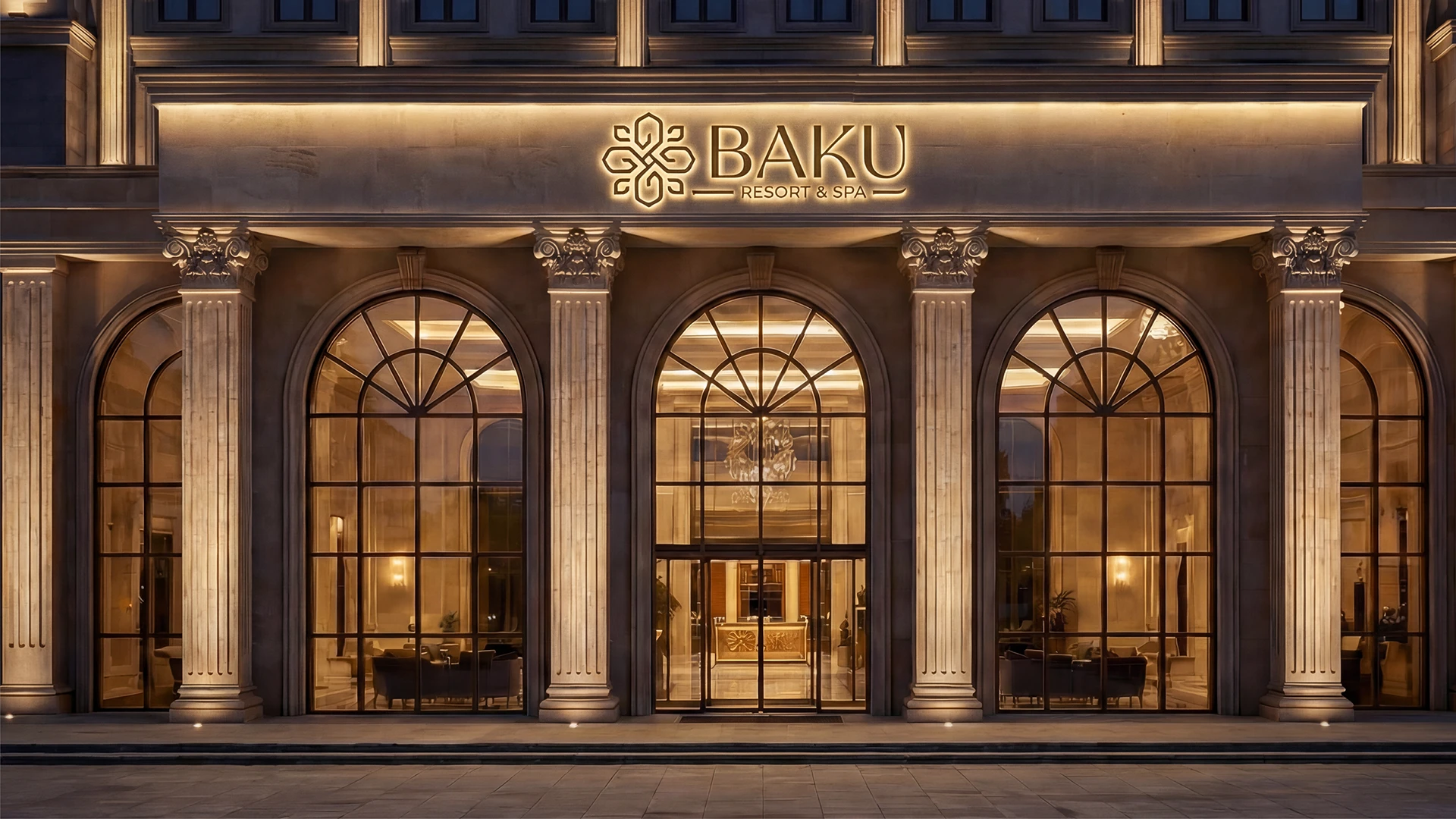
For Baku Resort & Spa, a hospitality destination in Kyrgyzstan, Element developed the full identity — logo, visual system, brand guidelines, and the corporate identity that carries them across every touchpoint.
Why the motif is abstracted, not illustrated
The mark draws on Azerbaijani architectural ornament. The decision that shaped everything was to abstract it rather than illustrate it.
A literal ornament is beautiful at one size and unusable at every other. Abstracted into a four-lobed geometric form built from a consistent stroke weight, the same mark can be cut into a metal signage panel, embroidered on a slipper, foil-stamped on a folder, or animated. One drawing, many materials — that is the whole test for a hospitality mark.
Guidelines are the deliverable
On a hotel project the logo is the smallest part of the work. The identity is executed by people the designer will never meet: a signage fabricator, a uniform supplier, a printer working from an emailed file, a social media manager two years later.
So the real deliverable is the guideline system — spacing rules, a defined minimum size, a small and enforceable palette, and worked examples of the wrong application as well as the right one. An identity survives on the quality of its rules, not the cleverness of its mark.
The digital layer
The motion work gives the static system a voice on channels where a still mark would sit inert — booking pages, social, screens in the lobby. It is deliberately quiet: the ornament assembles from its own geometry, and stops.
A hospitality brand is selling calm, and motion is very good at accidentally selling urgency instead.